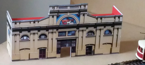
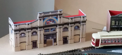
I spotted a nice photo of Queen Victoria Market, Melbourne, on the internet. After a make-over in Photoshop it came out like this:
It will be positioned towards the very back of the layout, so was it really necessary to improve the front. The shadows give it depth already. Anyway I made a few extra copies, cut out the columns, glued them to 1.5 mm cardboard and finally glue them in place on the front. Spot the difference.
I think it was worth the effort.
The sidewalls will be extended and a proper roof added. It has to wait until the hard lock-down in Melbourne is over and I can purchase a board for the the background. The market is in front of a curved ‘corner’ making the back part of the roof some of a challenge to get right.


